| Flowcharts | |
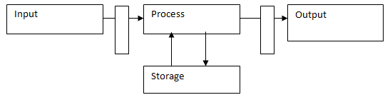
| Flow charts are the most basic but fundamental diagrams and tend to be used during analysis. Recall the input / output diagram
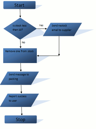
Flow charts show how the inputs change into outputs or more importantly how the processing occurs. Consider the basic example below -
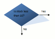
The diagram is fairly simple but covers a lot of the main points. It shows how a the stock control part of an order may occur. First of all stock is checked to see if stock is low (not that stock exists). The idea being that if there is low stock then you will preempt running out by ordering early. This requires input to say what the current stock level is. Notice that it is a Boolean question, or a yes/no question. This means the analyst must provide both paths in order for it to be complete.
The symbol above is known as a decision box and shows when a process may alter depending on the input. Now the current stock level is likely to be part of the overall system. However for this diagram it is taking it as input. So the input to the restocking process is, naturally, the current stock level. This is a good example of inputs not always being external to the system. A data flow diagram, which will be looked at next, helps make external and internal stimulus to the system much more clear cut.
This symbol is a process box and shows that some action, which is neither a input or a output, must occur. Think of a process box as something which needs to occur internally. It is easy to mix up a output and a process as they can be very similar. Just think if the information needs to be passed out of the diagram. If it does then it is an output, if not then it is a process.
As such the symbol above is an output as it is passing information to a separate part of the system. In this case, some form of message to the packing department to actually physically pack the item for dispatch. |
|


 Custom Search